Superimposition is a well-known term among graphic designers as the process of laying one image on top of another. In the new group exhibition at London’s Partners and Mucciaccia Gallery, four painters take the idea further both physically and intellectually. Paul Morrison, Barry Reigate, Michael Stubbs and Mark Titchner are leading British contemporary artists who, in their different ways, reference art history yet incorporate what they see in life around them in a mash up of styles and genres, all of which involve some type of superimposition.
Michael Stubbs, who gained his Fine Art PhD at Goldsmiths in 2003, also co-curated the show. He acknowledges that the traditions of formalism, abstract expressionism, 1920s constructivism and the like are all embedded in abstract painters’ psyches. But gone are the days when you can’t mix and match different genres and styles. “We don’t have a problem with cutting and pasting, we don’t adhere to strict manifesto or principle, “ he explains. “We allow figuration to come into abstraction. We allow cross-referencing of different historical styles. We allow pop culture into the paintings.”

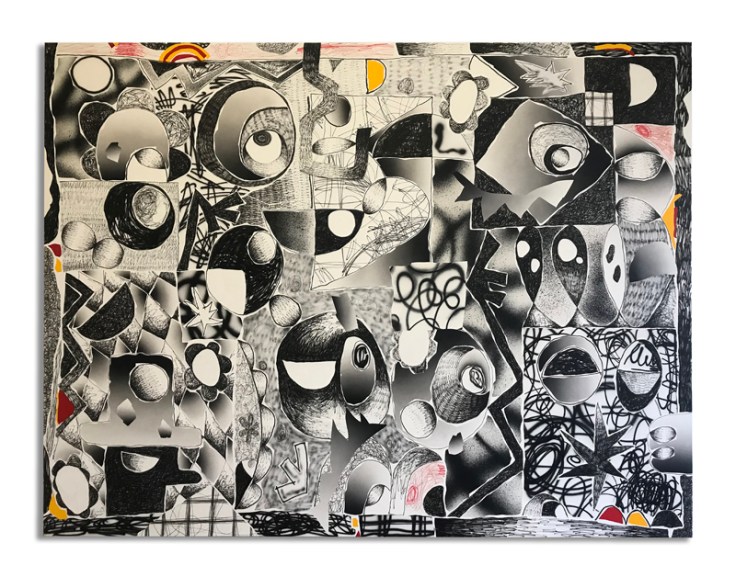
For Fresh Go Info and other works, Stubbs obscures graphic signs under abstract overlays. He uses household paints and floor varnishes with industrial tints. “Classicism undermined by utilitarian paint”, he muses. He has vinyl stencils made up and then, in a process à la Jackson Pollock or Maurice Lewis, he pours and tips the paint and, after it has dried, takes an image randomly, in this case wi-fi symbols, and pours more paint over a sticker. He then peels it off when that paint has dried. So it’s a physical layering, one on top of the other. Although the painting has a formalist look about it, there are elements within it that optically compete with each other so you’re not sure what to focus on. Stubbs is referencing here the mass of information that comes to us not only via the computer but in a world in which information screens are beaming at you almost everywhere, even at the bus stop.
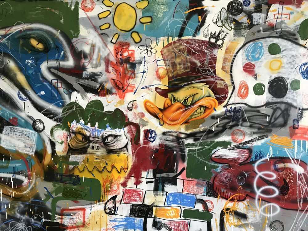
Barry Reigate,who holds an MFA from Goldsmiths, mixes different modes in his work, often borrowing graffiti from street kids as well as cartoon imagery. It Does Dunnit is a complex piece of escapism with eyes and curious shapes, all well thought out and technically adept. It mixes black and white with a colour edging and is deceiving in its perspective. There are no obvious focal points. It’s a clear example of how the digital screen has come to influence modern abstraction. The picture is very flat to emphasise this, yet it holds a very physical presence, in no way disembodied.
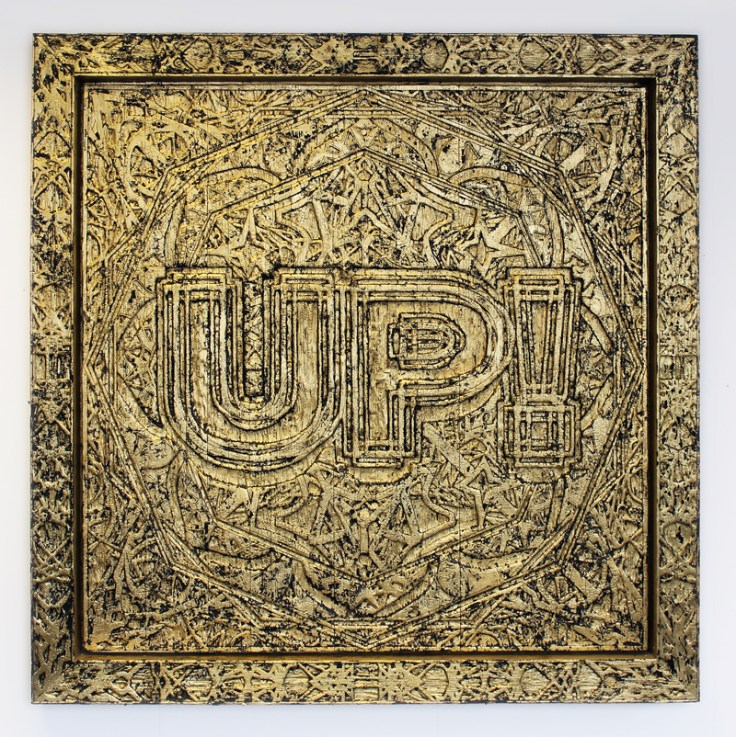
Mark Titchner’s superimposition tends to be with the written word. Up, for example, is typical of his penchant for using slogans, song lyrics, political statements or whatever to give his paintings another dimension. Titchner, a Turner Prize nominee from 2006, uses laser-cutting with the text but on hand-crafted wood that he has charred before applying gold paint, so once again there’s a strange mash-up. The word seems to almost disappear into the picture but as a viewer I’m not really sure quite what my response should be.
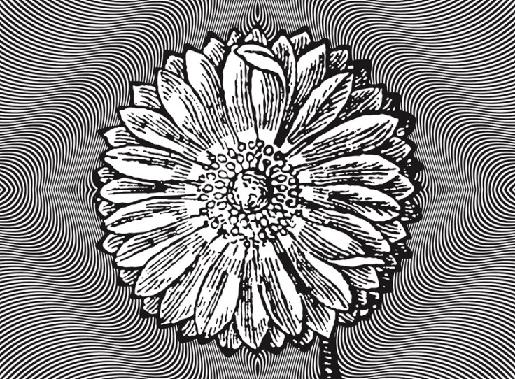
Ambiguity is also a feature of Paul Morrison’s oeuvre. In his monochrome paintings, he uses a recurrent motif of botanical imagery that he often sets in unlikely contexts. Psychotrope is typical. He has appropriated an early Bridget Riley painting with its psychedelic lines and placed within it a cartoon-style flower in a collision of different eras and styles. 16th century meets the 1960s sort of thing. Though black and white, he manages to subliminally introduce colour. There’s the associated colour of what you imagine the flower to be. There’s also that same colour effect in the the curved lines as in a patch of oil you might see on the road.
“There’s a collision of languages although in some senses you could say that the descriptive quality of the linear edges is consistent across the whole surface,” says Morrison. “It’s all razor sharp edges and fluidity, so there’s some commonality between the languages. On the other hand, the imagery is radically different, so it’s like a ‘60s movie where they have a dream sequence – something that’s mundane becomes absolutely bizarre, surreal and trippy.”
By mixing different genres, Morrison who holds an MA also from Goldsmiths College, questions presumptions about their place in some pictorial hierarchy and he sums up the view of all four artists by saying, “We’re just so over history painting being at the top and still lives being at the bottom. It’s not as simple as that anymore. There’s a whole different set of conditions at play.”
Superimposition is showing at the Partners and Mucciaccia Gallery, 45 Dover Street, London W1S 4FF until 31 August 2018.
All images are used courtesy of the artists and gallery

Leave a comment