The author Cressida Connolly once wrote of Tarka Kings, “Her drawings are so delicate and precise, they have a stillness and an openness that invites the viewer in. So little in contemporary art has that real beauty.”
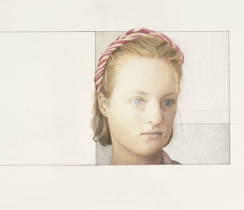
Though she wrote those words before Kings had drawn the portrait Lily III (above), the description fits it perfectly. Lily is a girl friend of Kings’s younger son. There’s a great sense of intimacy and delicacy in the drawing to be seen in those youthful eyes. What’s more, she has captured a degree of sadness in Lily’s dreamlike gaze. There’s a reason, Kings told me as we toured her exhibition. “She’d been in the earthquakes in Nepal and she’s suddenly become much much older than her years, very unexpectedly.”
Lily is a subject who recurs in this show of more than 20 new works, a mixture of portraits and abstracts. For the past decade, Tarka Kings has worked exclusively in pencil. Among her recent commissions have been murals at Chatsworth House, the stately home of the Duke and Duchess of Devonshire, and another one for the art historian Susanne Kapoor, former wife of Anish. Her work has been exhibited in many prestigious venues including the Royal Academy.

Her portrait subjects are all people she knows. Just Like a Woman (Kings is a lover of Bob Dylan, something that endeared me to her even before we’d met!) features her nine-year-old cousin. It’s a wonderful evocation of a youngster with that ‘can you get this over with as quickly as possible’ look in her demeanour. “I know she had a strong quality that I wanted to catch which was that she was very adult and very very childlike both at once and there’s something about the way she’s sitting at an angle away from the chair and everything that accentuates the awkwardness of it”. It’s another fine example of the artist capturing what she calls her subjects’ “interior life”.
In the drawing, the walls behind are portrayed in quite complex geometrical patterns that have become something of a signature of the artist’s recent work. Previous series have been dominated by them. The top of the head and the feet are cut off which gives a hint of claustrophobia to the work.
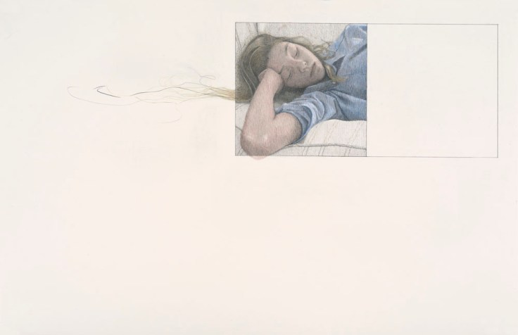
By contrast, the same subject is conveyed with a sense of space in School Girl. As we saw with a fraction of the hair and headscarf in Lily III, we see her hair and part of her elbow bleeding out of the given frame. It’s a curious mixture of containment and freedom. “I’m very interested in having boundaries and breaking boundaries, and so it’s something that’s very orderly and and something that’s escaping or not behaving as it should.”
Putting blank boxes around her drawings was originally because she was thinking of turning some of them into a book but then envisaged them as a way of creating a feeling of space and engendering different feelings and atmosphere. It helped provide a sense of movement too.

Gone Girl is a case in point. It’s a controlled but almost anarchic piece in the way the dress swirls and the text seems to emerge from two frames like a thrown lasso. In the same way in which a photographer uses a slow shutter speed to create a sense of movement, Tarka Kings has achieved the effect with the most delicate and precise use of infinitesimal pencil marks that change direction. “By doing everything in these straight lines, you could make it very soft with no edges to things,” she says.
The technique is inspired by the pointillist drawings of Georges Seurat. Coincidentally, Bridget Riley cites Seurat as an influence and in this show there are several examples of Japanese paper cut-outs that bear a certain resemblance to Riley’s coloured line drawings, though any cross-fertilisation is unintended.
Using text in her works is a relatively new departure for Kings and is a further example of a freer style. She uses quotations from Shakespeare and from musical references in some of her drawings and they work best when they integrate themselves almost seamlessly into the picture.

Sometimes is a good example. Between two curtains is a sentence that begins “Sometimes nothing rhymes…” and the words get all jumbled up. It should hang on the walls of all poets suffering from writer’s block. It adds another dimension to the drawing and, as Kings puts it, “enables me to just mess around again”.
Still is Still Moving is showing at the Offer Waterman Gallery, 17 St George St., London W1s 1FJ until 20 June 2018.
All images are courtesy of the artist and gallery.

Leave a comment